By the time most founders think about branding, they're already juggling sixteen other fires. So when Psyche Digital was invited to support thirteen early-stage companies in the Colorado SEA Change Cohort with logo design, color palettes, and pitch decks, all in under a month, I had two immediate thoughts:
- This is so aligned with our mission.
- This might kill me.
The opportunity was a dream: thirteen social impact startups, each with a meaningful mission and a scrappy spirit, all being incubated through the SEA Change initiative. We were tasked with giving each one a visual identity they could bring into their pitch competitions, investor conversations, and communities. Deliverables included four logo concepts (refined to one final), a color palette, and a custom slide deck, all completed quickly and with only ten minutes of facetime per founder before the design phase.
I decided to take this project personally as a creative exercise and to allow our team to stay focused on their dedicated projects. I hadn’t been this hands-on in creative execution in a while, and as the founder of Psyche Digital, that felt exciting. It also meant I had to stretch every muscle I had, creative, strategic, and logistical, to pull it off.
The Brief: Get Deep, Fast
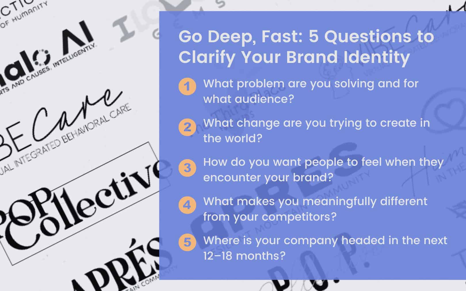
Normally when we offer branding services to a client, we spend a minimum of 90 minutes in a discovery session. For SEA Change? Ten. We were allocated just 10 minutes of facetime with each founder.
To make that work, we created a front-loaded survey that asked founders to describe their offerings, preferred visual styles, brand personality, and mission. Then we hit them with rapid-fire follow-ups in a short face-to-face meeting.
The challenge was getting to the truth fast. What’s really at the heart of this business? Who are you trying to become in the market? What change are you here to make?
And sometimes, the answer was: still figuring that out.
Which is fine. That’s what early-stage looks like. But it meant designing with flexibility in mind, creating brand systems that could evolve as the companies did.
My Design Philosophy: Generosity
When time is short, the temptation is to cut corners. To default to design patterns. To crank out “good enough.”
But that felt misaligned with the spirit of the cohort and the work they were doing. So I asked myself: how generous can I be with my creativity in the time I have?
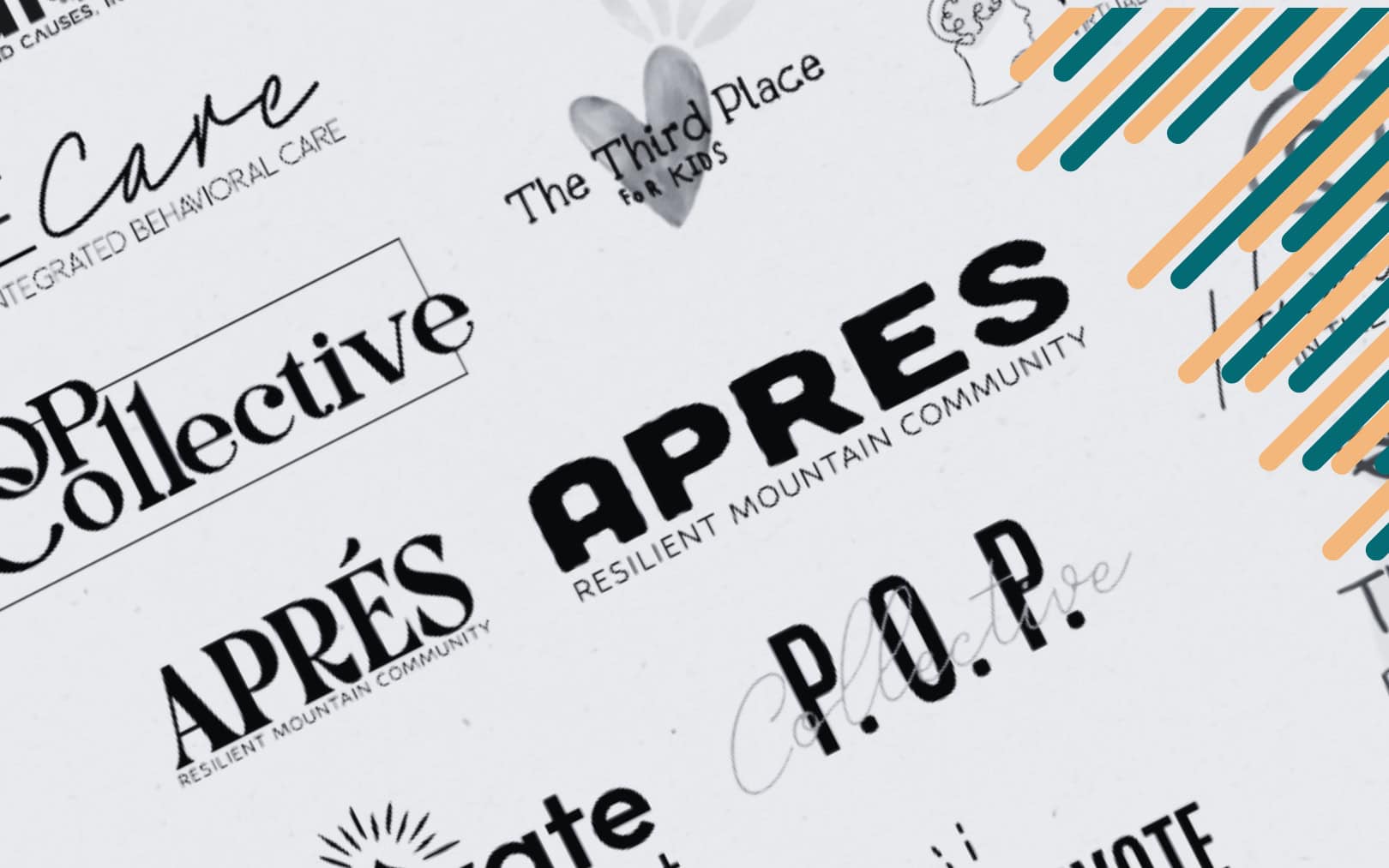
Each company received four logo concepts, each exploring a different interpretation of their identity. Some leaned abstract, others literal. Some soft and friendly, others bold and future-facing. The goal wasn’t to be exhaustive, but to be expansive. To say: here’s how I see you and here are some ways the world might, too.
Patterns, Surprises and the Art of Color
The biggest throughline? Brand ambiguity. Many founders were still finding their footing, mission, positioning, and audience. That’s okay. But it reinforced something I say often: visual branding should communicate the value you’ve already defined. If that foundation isn’t clear, the logo will have to evolve as your business does.
That said, there were surprises.
Like Après (a sub-brand of Pretty Moving). The founder was clearly an artist, someone who saw in visuals. Her standards were high, her vision sharp. It took a few iterations, but what we landed on felt like a genuine collaboration.
And then there was I Love ME Gems. I didn’t need to do much with the logo she already had in use, just a few tweaks. So I focused on color. Her original palette was earthy and warm. I introduced some bold turquoise and green for contrast and movement. Her response? “You read my soul.”
That was the moment I remembered: design isn’t just a business tool. It’s identity work. And color is often where that emotional resonance lives.
Lessons from the Chaos
Was the timeline brutal? Yes.
Did I underestimate how long it would take? Also yes.
Would I do it again? In a heartbeat, with a few changes.
Here’s what I’d do differently:
- Allow 20–30 minutes of facetime per founder, minimum.
- Build in more realistic internal padding for creative iteration.
- Spend more time refining one strong direction rather than perfecting four that might never be chosen.
Because in a sprint like this, clarity and prioritization win. Get the conversation started with strong directions, then refine with focus.
Final Takeaways: For Founders and Creatives Alike
- If you’re a founder just starting to brand your company: Don’t skip the foundational work. Get clear on your mission, your audience, and how you want to be positioned before diving into visuals.
- If you’re a designer or marketer supporting early-stage businesses: Be flexible. Offer creative generosity. But also guide. A confused brand can’t be clarified by a logo alone.
And if you’re me? You remember why you started this agency in the first place.
This project reminded me how much I love helping mission-driven companies step into the visual version of their future. At Psyche Digital, we might help make things pretty, but we’re also helping leaders articulate their identity, claim their space, and move with clarity.
This work takes strategy, soul, and stamina, and I wouldn't have it any other way.
If you're curious about how your brand identity could evolve, or want help clarifying your positioning, I'd love to connect. Schedule a free Ignite Call to explore where your brand is headed today!